UI / MyBodyLab / Field notes
Make the next step
obvious.
A UI attention heatmap case study: how we review MyBodyLab’s onboarding, compare the visual hierarchy, and check it against recorded choices.
MyBodyLab and AttentionProof are our products. This is a first-party design study.
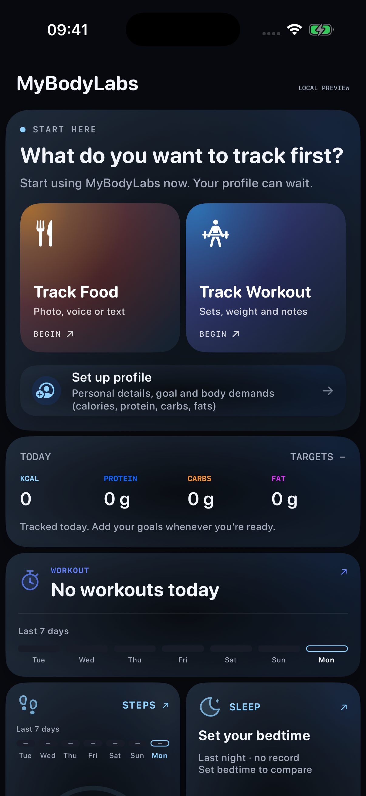
Food and workout are the large, named choices. Profile setup has less visual emphasis.
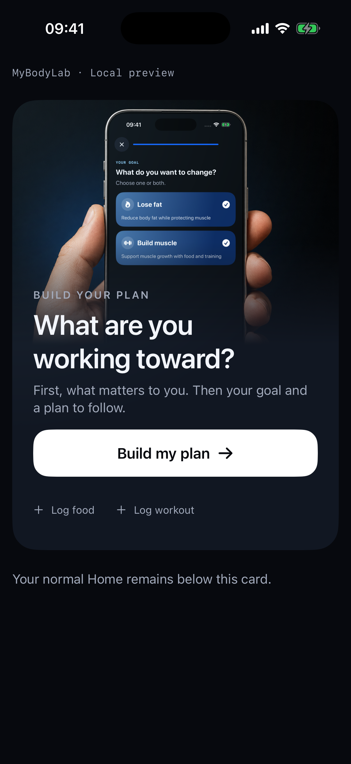
Build my plan becomes the prominent action. Quick logging stays available underneath.
Native app components with sample state. Open either image to inspect it. The earlier Home and current entry-card preview show different amounts of surrounding UI. Their scores are not a controlled before/after performance test.
01 / The decision
A useful choice should meet the person where they are.
Someone opening a nutrition and training app may want to log a meal, record a workout, or get a plan. Asking them to explore every tab before doing that adds work. Our design goal was to put a useful next action directly into that first moment.
In MyBodyLab 2.7.4, the fresh Home screen made tracking the clear invitation. Two large cards said “Track Food” and “Track Workout.” Profile setup was a smaller choice below them.
The current entry introduces a different priority: a guided plan. Real MyBodyLab screen artwork explains the destination. A large white “Build my plan” button offers the next step, while food and workout remain available as quieter links.
This combines product thinking with AttentionProof. We choose what should matter in context, then inspect whether the visual treatment supports that choice. The heatmap gives us evidence to discuss before the next release.
02 / The prediction
What the two heatmaps actually show.
We ran both English captures through the same AttentionProof scoring pipeline. The values below are each region’s share of the prediction across its full image. They are not percentages of users, viewing time, or taps.
Earlier Home
- Track Food
- 15.9%
- Track Workout
- 11.3%
- Set up profile
- 5.8%
Food carries the most predicted attention among these controls. That matches the tracking-first hierarchy.
Current entry
- Build my plan
- 6.8%
- Log food
- 0.7%
- Log workout
- 1.0%
The white plan button has the largest total share among the three live actions measured in this frame.
The illustration and main prompt receive more predicted attention than the plan button: 31.8% and 27.6%. The strongest point falls inside the pictured phone. That gives us a concrete review question: does the artwork help someone understand the plan, or draw attention away from starting it?
A larger region can collect more predicted attention simply because it occupies more space. The secondary links are more salient per unit of area than the white button. Size, contrast, words, imagery and task relevance need to be considered together.
Compare the priorities inside each frame. The captures contain different surrounding UI, so their percentages do not establish a before/after improvement.
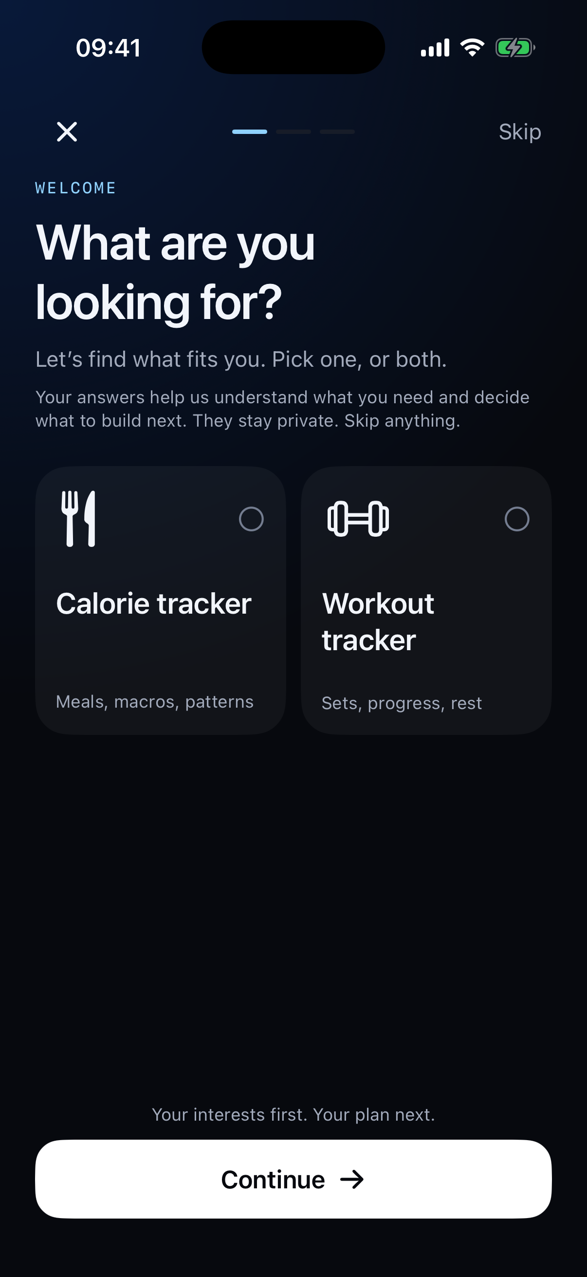
03 / Inside onboarding
Ask a relevant question.
Make the next action clear.
The onboarding itself continues that hierarchy. It asks what the person wants to do, presents the choices, and provides a white Continue button.
On this exact screen, the question and its explanation hold 39.9% of predicted attention. The calorie and workout choices hold 12.8% and 14.1%; Continue holds 2.6%. The question is the strongest point in the prediction.
That is a useful distinction: a clear next-step button can support the flow while the question and choices do the explanatory work. We still need recorded new-user behavior to learn whether the sequence works as intended.
Inspect this screen’s attention overlay ↗04 / Recorded choices
Food first. Workout next. What happened after matters.
An earlier study reconstructed one real 2.7.5 signup from named app events. The Home choice components were unchanged from 2.7.4. Its Russian-language fixture gave Food 17.6%, Workout 15.2% and profile setup 5.6% of predicted attention. This is a separate capture from the English comparison above.
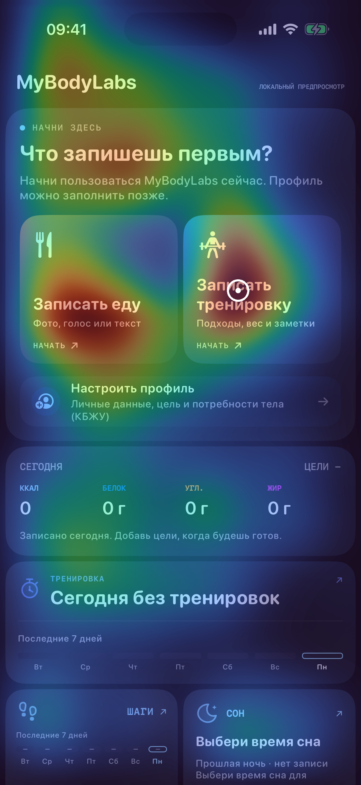
- First Home choiceFood
The person selected food three seconds after the recorded Home entry.
- After cancelling the cameraWorkout
Workout was selected one second after cancellation. Neither route produced a saved entry in this trace.
- Later in the same sessionOther areas were explored
The person reached Plan and Day. The record does not support a claim that they never left Home.
These events show which named controls were selected. We did not record gaze or touch coordinates, and the fixture was not a recording of that person’s screen. The agreement is descriptive evidence from one person, not a validated click predictor.
05 / The wider usage context
Staying on Home can be useful. Check what gets done there.
Our working idea is that people may stop exploring once a visible choice solves their immediate need. A well-placed action can reduce the need to navigate. The logs can show activity; they cannot tell us that this was someone’s reason for staying.
| App version | Home sessions | No other recorded main tab |
|---|---|---|
| 2.7.5 / build 56 | 238 | 226 |
| 2.7.6 / build 58 | 19 | 17 |
The 2.7.5 observations span September 3–12 across 14 installations recording Home. The 2.7.6 observations span September 11–12 across four. These are repeated sessions, not counts of distinct people.
Of the 226 earlier-version sessions without another recorded main tab, 31 included a logging or first-value event. This supports Home’s role as an action hub. Missing lifecycle and navigation events mean we cannot treat every other session as either satisfied or abandoned.
The current version’s four observed App Store installations had all been observed on older versions. No Welcome events were recorded for them. Missing Welcome records do not establish whether onboarding was completed. They do not form a new-onboarding cohort, so there is no measured new-onboarding conversion result here.
06 / Try it on your creative
The same review loop works for ads, UI and visuals.
- Name the job. For an ad, it might be noticing the product and understanding the offer. For an app, it might be finding the next useful action.
- Capture the actual image. Keep language, device, crop and state consistent when testing a specific design change.
- Inspect the prediction. Run the image through AttentionProof. Compare the original and overlay, including anything competing with the intended focus.
- Change one priority deliberately. Try a clearer label, stronger contrast, quieter artwork or a more useful arrangement. Then recheck.
- Measure what happens next. Use recorded actions and task completion for UI; use campaign outcomes for ads. A visually prominent action still needs to lead somewhere useful.
For iOS, Android, Mac and web apps, the input can be a screenshot. Through MCP, Claude or Codex can send that image, inspect AttentionProof’s result and help revise the design. This case documents iOS; the workflow can be applied elsewhere without assuming the same outcome.
Apple’s button guidance recommends using prominence to distinguish a preferred action. Nielsen Norman Group’s visual hierarchy guide explains how scale and contrast communicate priority. Neither replaces observing whether someone completes the task.
What should people notice in your next ad?
Bring the creative, inspect the attention overlay, and choose your next test.
Check my creative free ↗See the ad exampleHow this case was made.
The historical English Home capture comes from the installed MyBodyLab 2.7.4/build 55 simulator binary. Current entry and onboarding captures come from a September 12 development compile reporting 2.7.6/build 58. Their Welcome source and bundled artwork match the September 10 release source. They are native component previews with sample data, not customer screenshots.
All new captures are 1206 × 2622 pixels. They were scored with the same local AttentionProof pipeline. Control regions were selected from visible bounds before scoring; reported shares integrate prediction mass inside those regions. The old Home includes adjacent empty cards, while the current entry preview isolates its entry card. This is a design comparison, not a controlled performance experiment.
The historical behavioral example uses the earlier study’s exact Russian fixture and prediction. Its named action events have no touch coordinates. Aggregate usage excludes known internal and test traffic where identifiable, but event coverage remains incomplete. Counts refer to sessions or installations as labeled, not unique people or conversion rates.
Read the public measurement and evidence record. It contains aggregate figures, image hashes and measurement definitions. Private account identifiers and raw event logs are excluded.
Common questions.
Does an attention heatmap predict where someone will click?
It estimates visual salience in a static image. It does not measure an individual's gaze or output a calibrated click probability. Compare the prediction with separately recorded actions or a usability test.
How do I use AttentionProof to review an app UI?
Capture the screen and state you want to review. Run the image through AttentionProof, inspect the original and attention overlay, choose a layout change, and check the revised screenshot. Then measure whether people complete the intended task.
Can this workflow be used for Android and Mac apps?
Yes. The input is a screenshot, so the same review workflow can be used for iOS, Android, Mac and web interfaces. This case study documents MyBodyLab's iOS UI; it does not establish results for those other platforms.
Did the new onboarding increase conversion?
That has not been established. The available current-version installations had been observed on older versions, with no recorded Welcome events. The screenshots and predictions explain a design decision, not a measured conversion lift.