Attention Insight vs AttentionProof vs EyeQuant at a glance
| What you want to do | Attention Insight | AttentionProof | EyeQuant |
|---|---|---|---|
| Inspect predicted attention | Heatmaps, focus maps and areas of interest | Original, heatmap, overlay and combined image export | Attention maps, perception maps and hot spots |
| Interpret the result | Attention percentages, clarity and focus scores, AI recommendations | Visual comparison; API/MCP can measure regions you specify | Clarity and excitingness scores, region visibility and recommendations |
| Use it in an existing workflow | Browser, design integrations and API | Browser, API and MCP connections for tools such as Claude and Codex | Browser, design integrations, API and MCP offerings |
| Review motion | Video analysis available | Static PNG/JPEG images | Video and animation analysis available |
| Start evaluating | Trial and paid plans | Two free checks total per account | Free trial; contact sales for paid pricing |
The entries describe documented capabilities, not every plan entitlement. Check the current Attention Insight features, AttentionProof workflow, EyeQuant product and EyeQuant integrations before choosing a plan.
What the saved Linear heatmaps show
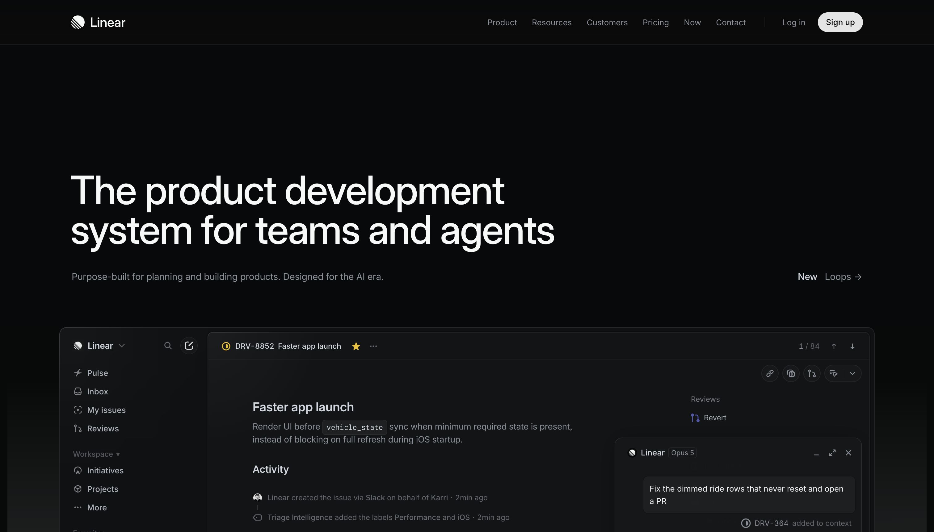
The example has a large two-line headline, a small supporting sentence, a navigation bar, a “New Loops” link and a product interface preview below. The practical question is how those elements compete for attention.
How this comparison was prepared
We inspected one saved AttentionProof export, one watermarked Attention Insight overlay and two supplied EyeQuant result screenshots. The Attention Insight and AttentionProof images are reproduced below. The EyeQuant observations describe the supplied screenshots. The original analysis dates are not independently verified. Product features and prices were reviewed separately on September 7, 2026.
The images depict the same design, but we cannot confirm identical upload bytes, preprocessing, model versions or settings across all three tools. EyeQuant’s enlarged attention view has Engaged selected. Its browser controls also leave a different visible crop. No participant eye-tracking data or conversion experiment accompanies these examples. The observations below concern the saved visualizations, not calibrated numerical differences between models.
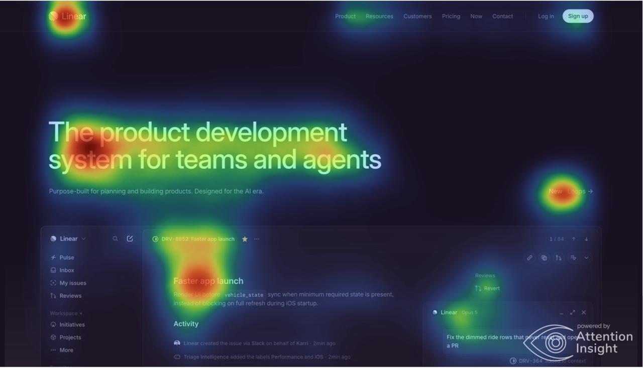
Attention Insight: the logo and announcement also stand out
The Attention Insight overlay shows warm areas across the headline and product preview. The Linear logo at the upper left and the “New Loops” link at the right also have distinct warm hotspots.
For a designer, that creates a useful question: should the announcement draw that much visual emphasis alongside the main message? If the announcement is important, this may align with the design goal. If the priority is the main product proposition, it is a reason to inspect the balance.
AttentionProof: the headline shares attention with the product preview
AttentionProof’s saved triptych places the original beside the heatmap and overlay. It shows strong warm areas around the headline and the “Faster app launch” section of the product preview. The preview’s left sidebar also has visible activity. The logo and announcement link are comparatively subdued within this output.
The useful design question is whether the product preview supports the headline or competes with it. A revision could change the preview’s size or contrast, then recheck the same crop. That would test a design hypothesis; this saved result does not tell us whether the revision would help people understand the product.

EyeQuant: a more concentrated headline visualization
In the supplied EyeQuant result screenshot with the Engaged attention view selected, the strongest visible emphasis follows the headline text. Much of the surrounding interface remains subdued. Compared with the other saved overlays, this rendering makes the headline especially prominent.
That observation is specific to the selected view. It does not show that EyeQuant always predicts less attention on product imagery, or that its New Visitor view would produce the same result.
The second supplied EyeQuant result screenshot displays Clarity 75 and Excitingness 34. These are EyeQuant’s labeled scores for this saved analysis. They are not accuracy percentages, conversion predictions or scores we can assign to the other two tools.
The practical difference
All three saved results show predicted attention around the headline. The differences become useful when you inspect the surrounding elements: Attention Insight makes the logo and announcement conspicuous, AttentionProof shows substantial activity in the product preview, and EyeQuant’s selected view concentrates the visible emphasis on the headline.
Use those differences to choose questions for the next revision. A larger or redder hotspot, by itself, cannot tell you which model is more accurate. Rendering, smoothing and display scales affect how a heatmap looks.
Why the attention scores are not interchangeable
A share of total attention and visibility relative to an average pixel answer different questions. Attention Insight describes an area’s Percentage of Attention as its share across the image, with the whole image representing 100%. EyeQuant’s region documentation describes visibility relative to the average pixel. Attention Insight FAQ, EyeQuant result guide.
For illustration, a region receiving 20% of total predicted attention is a statement about its share of a whole. A region described as 100% more visible than average is a statement about relative intensity. Those figures cannot be subtracted to declare a winner. These example numbers are explanatory, not measurements from the Linear images.
Region boundaries matter too. Enlarging a box can change its attention share because it includes more of the image. AttentionProof’s agent workflow accepts caller-specified regions; a name such as “CTA” comes from the supplied region definition. It is not evidence that the model automatically identified the button’s purpose. AttentionProof API specification.
Pricing and access: what can you try now?
Competitor pricing reviewed on . AttentionProof pricing updated on :
| Product | Public entry point | What to check |
|---|---|---|
| Attention Insight | Basic is €29/month when billed monthly, with 40 credits and one seat; a 14-day trial is advertised | Credit consumption varies by action. Basic includes a watermark. Check annual billing, reporting, API and team entitlements. |
| AttentionProof | Two free checks total per account, with no card required. Planned paid options: Starter US$19.99/month for 30 checks; Pro US$49.99/month for 100 checks; US$0.99 for one extra check, purchased once. | The free allowance does not renew monthly. Paid options are not yet available to purchase. Purchases will be made in the iPhone app, with Apple’s local prices shown before confirmation. |
| EyeQuant | Free trial advertised without a card; contact sales for paid pricing. Basic lists 50 analyses monthly for one user | Request the price and the specific integrations and analysis types your team needs. |
Sources: Attention Insight billing plans, AttentionProof pricing, EyeQuant pricing.
A credit, check and analysis are not automatically the same commercial unit. Compare the cost of your actual workflow: an initial image, a revision, any recommendations, exports and team access. Recheck current prices and availability before purchasing.
Which tool fits your workflow?
Consider Attention Insight if you want heatmaps, selected-area attention percentages and design feedback within a design-tool workflow. Its documented feature set also includes video analysis. Confirm which plan covers the integrations and reports you need. Attention Insight features.
Consider AttentionProof if you want to inspect a static image, revise it and compare the next output, either in the browser or with a connected agent. The two free checks support that first comparison. The current offer is narrower than a team research suite, and paid access is not yet available at this review date. Try AttentionProof.
Consider EyeQuant if your team wants attention maps alongside clarity and excitingness measures, analysis guidance and broader design-review tooling. Its current site also advertises video, full-page analysis and integrations including MCP, so agent connectivity alone is not a reason to rule it out. EyeQuant product, EyeQuant integrations.
These are workflow recommendations based on documented capabilities and the saved examples. Saliency benchmarks use several metrics, including AUC, NSS, correlation and similarity, rather than one universal accuracy percentage. MIT/Tübingen evaluation methodology.
Common questions
Why do AI attention heatmaps differ for the same design?
Possible reasons include different models, preprocessing, viewing modes, crops and visualization settings. In the saved Linear examples, EyeQuant’s Engaged mode is visible, while equivalent settings are not documented for every output. The images cannot isolate a single cause of the differences.
Which is more accurate: Attention Insight, AttentionProof or EyeQuant?
This comparison does not establish an accuracy winner. Different-looking heatmaps demonstrate disagreement between saved outputs. Ranking prediction accuracy requires the same evaluation conditions and relevant human eye-tracking reference data.
Can these heatmaps predict clicks or conversions?
A predicted attention map estimates visual salience. It does not establish whether someone understands an offer, clicks a button or buys. Use it to develop design hypotheses, then measure those outcomes separately. EyeQuant explicitly distinguishes its predictions from clicks and conversions; AttentionProof states the same boundary. EyeQuant science and limits, AttentionProof explanation.
Is AttentionProof an EyeQuant alternative?
AttentionProof is an option for static-image attention checks and a capture, inspect, revise, recheck workflow. Evaluate it against the specific EyeQuant capabilities you use, such as video, design scores, reporting or team access. The products are not interchangeable feature for feature.
How should I compare the tools on my own design?
Choose one image and write down what should stand out. Use the same dimensions and crop in every tool, record the selected modes, and preserve the outputs. Interpret each score using its own definition. Make one revision, repeat the checks and validate the intended outcome with appropriate user research or a live experiment.
Your next image
Try the comparison on work you can still change.
Choose an ad, slide or interface. Use the first AttentionProof check to inspect its predicted attention, then use the second to compare one revision. Keep the original, prediction and your intended focus together as you decide what to test next.
Check your image free Two checks total per account. No card required.